pacman::p_load(
  tidyverse
)Daily Data Visualization with R: Jitter Plot
R
ggplot2
data visualization
tidyverse
health
jitter
A detailed guide on using geom_jitter() to visualize BMI distributions across sex using data from the Spanish European Health Survey 2020.
Introduction
Data visualization is a powerful tool in understanding complex datasets, especially in the field of public health. In this tutorial, we will use Quarto and R to create a jitter plot, which is especially useful for visualizing the distribution of data points along a continuous axis. Jitter plots help to overcome the issue of overlapping points by adding a small amount of random noise to each point.
In this blog post, we will explore how to use the geom_jitter() function from the ggplot2 package in R to visualize the relationship between sex and Body Mass Index (BMI) distributions using data from the Spanish European Health Survey 2020, discussed in a previous post.
Load Libraries
First, we load the necessary libraries.
Import and Clean Data
To begin, we import the dataset from the Spanish European Health Survey 2020 and perform necessary data cleaning steps.
file_2020 <- "MICRODATOS_PUBLICACION_CADULTO.txt"

# Read using read_fwf
data_raw <- read_fwf(
  file_2020,
  col_positions = fwf_cols(
    sex = c(13, 13),
    age = c(14, 16),
    height = c(369, 371),
    weight = c(372, 374)
  ),
  col_types = "iiii", # set all columns as integers
  na = c("998","999") # Missing values encoded as 998 (doesn't know) or 999 (doesn't answer)
)

# Clean data and calculate BMI
data_clean <- data_raw |>
  mutate(
    sex = factor(sex, labels = c("Male", "Female")),
    bmi = weight / (height/100) ^ 2
  )

glimpse(data_clean)
Rows: 22,072
Columns: 5
$ sex <fct> Male, Female, Male, Female, Male, Female, Female, Female, Male,…
$ age <int> 60, 87, 38, 43, 41, 34, 60, 79, 87, 82, 77, 44, 47, 16, 48, 25,…
$ height <int> 175, NA, 174, 164, 169, 167, 159, 150, 178, NA, 155, 184, 181, …
$ weight <int> 74, NA, 80, 58, 74, 90, NA, 73, 72, 64, NA, 86, 85, 56, 67, 87,…
$ bmi <dbl> 24.16327, NA, 26.42357, 21.56454, 25.90946, 32.27079, NA, 32.44…Visualize Data
Next, we create a visualization to explore the relationship between sex and BMI.
# Create a random sample of 1000 participants for better visualization
set.seed(123)
data_sample <- data_clean |>
  slice_sample(n = 1000)

# Create jitter plot using ggplot2
data_sample |>
  ggplot(aes(x = bmi, y = sex, color = sex)) +
  geom_jitter(alpha = 0.7) +
  geom_vline(xintercept = c(25, 30), linetype = "dashed") +
  scale_x_continuous(
    limits = c(15, 50),
    breaks = seq(15, 50, 5)
  ) +
  theme_classic() +
  theme(legend.position = "none") +
  labs(
    x = "Body Mass Index (kg/m²)",
    y = "Sex",
    title = "Adult Males Tend to Have Higher BMI than Females",
    subtitle = "Excess Weight is Highly Prevalent in Both Sexes",
    caption = "Dashed lines represent thresholds of overweight (25 kg/m²) and obesity (30 kg/m²).\nData source: random sample of 1000 participants in the Spanish European Health Survey 2020."
) 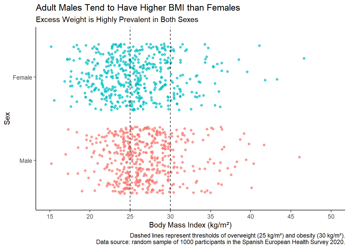
Plot Interpretation
The jitter plot above visualizes the distribution of Body Mass Index (BMI) across sexes based on a random sample of 1000 participants from the Spanish European Health Survey 2020. Each point represents an individual’s BMI, with female data points in blue and male data points in red. The dashed lines at BMI values of 25 and 30 represent thresholds for overweight and obesity, respectively.
The jitter plot provides a visual representation of how BMI varies between males and females in the surveyed population. It highlights the prevalence of excess weight (overweight and obesity) in both sexes, with males tending to have higher average BMI compared to females.
When using jitter plots, we need to take into account the following pros and cons.
Pros of Jitter Plots
Preserves Individual Data Points:
geom_jitter()displays each data point individually, making it suitable for visualizing the distribution of discrete data or small datasets.Handles Overplotting: It adds a small amount of random noise to data points, reducing overplotting and providing a clearer view of the distribution.
Suitable for Categorical or Discrete Variables: Particularly useful when visualizing relationships between a continuous variable (like BMI) and a categorical variable (like sex).
Cons of Jitter Plots
Limited for Large Datasets: When dealing with large datasets,
geom_jitter()can become cluttered, making it challenging to interpret the density of data points accurately. That’s why we have sampled a subset of the original dataset for creating this visualization. For larger datasets,geom_density()orgeom_histogram()might provide a clearer view.Not Suitable for Exact Data Counting: Because it spreads points out to avoid overlap, it can obscure the true density of data points in a specific region.
Conclusion
Jitter plots are valuable for visualizing the distribution of data points, especially when dealing with overlapping data in datasets of limited size. By using ggplot2 and geom_jitter(), we can effectively explore and communicate insights from complex datasets such as health surveys.