How to draw an Alluvial Plot in R with example code.
Author
Carlos Fernández
Published
February 22, 2024
Introduction
In this post, I explain how to create an alluvial plot using code in R
What is an Alluvial Diagram
An alluvial diagram or plot displays the flow of information from one categorical variable or stage to the next. The term “alluvial” refers to its resemblance to the flow of a river.
Uses of Alluvial Diagrams
Alluvial diagrams are commonly used in the following situations:
To demonstrate the number of participants in a study transitioning from one baseline category to a subsequent category. For example, the number of participants randomized at the beginning of the study and who continue to follow-up at the end. It serves as a graphical supplement to flowcharts, which present information with arrows and boxes containing text and numbers.
To show the distribution of participants among different categorical variables. In this case, it provides a more “visually appealing” alternative to stacked column charts.
R Code
Preparativos
For this example, we will use the ggalluvial and ggplot2 libraries. The data come from a study on language learning using the web application LingQ (Link to the article).
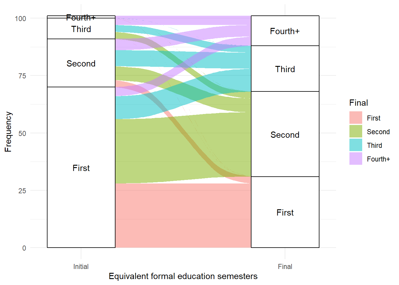
  Initial   Final Frequency
1   First   First        28
2   First  Second        28
3   First   Third        10
4   First Fourth+         4
5  Second   First         3
6  Second  Second         6
In this study, a total of 192 individuals were selected for the sample and completed the initial knowledge test. Out of these, 101 completed the final test and studied for at least two hours in the application, and were included in the analysis. The data show the equivalent language knowledge in formal education semesters (“First”, “Second”, “Third”, “Fourth or more”) at the beginning of the study (“Initial”) and after using the application (“Final”).
Note: The data have been extracted from the example article from the result tables and are just an example of a data distribution compatible with those results.
In the alluvial diagram, the area of the colored zones is proportional to the frequency, so wider “flows” represent more participants.
The graph shows how the majority of the flow occurs from bottom to top; that is, knowledge tends to improve more than deteriorate. For example, more than half of the participants who started from the first semester of knowledge progressed to the second, third, or fourth semester.
It can also be seen that almost all participants who ended with a knowledge level equivalent to the first semester started from that previous level, and a few decreased from the second semester to the first semester.
In conclusion, alluvial diagrams provide a visual option for better understanding data flows between categories.